 Skip to content
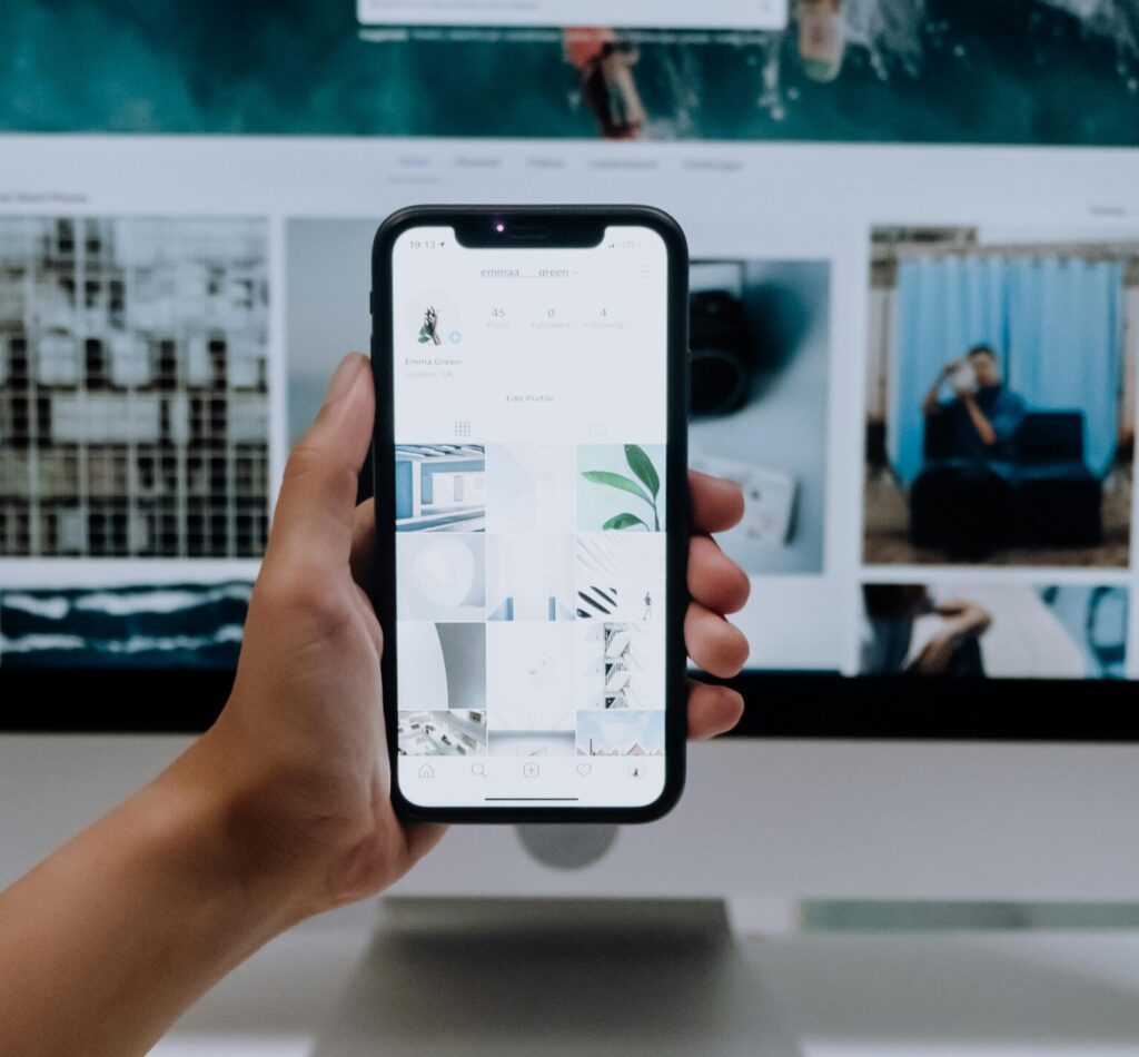
Most people are using their phones more and more. In fact, according to recent studies, 98% of the world use their mobile phones to access the internet. They don’t have their laptops attached to their hips but their phones are a different story.
While laptops, desktop computers, and tablets are still popular, our phones are beside us wherever we go. Therefore, when you need to check emails, the weather, or purchase something last minute, it will be probably through your phone.
While you design your website for the mobile version, make sure you keep in mind these requirements:
Make It Single File!
Making everything in a single-column layout is the best first impression. Don’t make your viewers and potential customers zoom in to read your website. Take that extra step out of the equation and swap it to a bigger font size. Then all they have to do is scroll down if they want.
Make It Shareable!
Have all the social media icons accessible. People want to be able to follow and share your content on their phones.
Have Contact Buttons
Have a “Click to Call/Email/Chat” button so people will have easy access to reach you. They should never have to feel frustrated with your mobile website. But if they are confused, make it even easier to contact you! A happy customer means more profit for you!
Not every business needs an application. They do need a great mobile web version and these steps will help you succeed!
